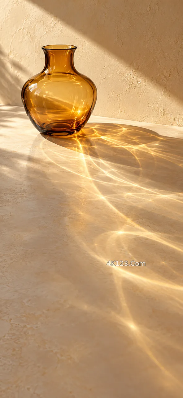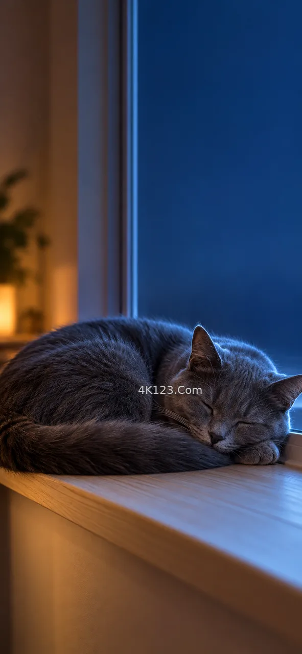
Since Android 12, a phone set to dynamic colour samples the wallpaper, reduces it to a handful of candidate hues and picks one seed colour. From that seed it builds tonal palettes, each running from near black to near white, and the system hands them out to quick-settings tiles, sliders, the keyboard and any app that asks. Windows has a quieter version of the same idea in its automatic accent colour, and iPhones tint the lock screen clock to sit with whatever is behind it.
The sampler does not take the largest area of colour at face value. It favours hues that are both common in the image and reasonably saturated, so a grey sky with a small orange boat may well hand you an orange theme. A photo that is almost entirely neutral, such as fog, snow or concrete, gives the algorithm little chroma to work with, and the result tends towards a soft, slightly bluish grey that can look washed out on every button.
So when a portrait image goes onto the home screen, it is worth looking at it once more as a source of colour rather than as a picture. One clear accent against a calm field usually produces the most legible theme, while an image with four competing colours leaves the choice to chance. Most phones also offer two or three alternative palettes drawn from the same wallpaper, and the second option is often the one that reads better at small sizes.