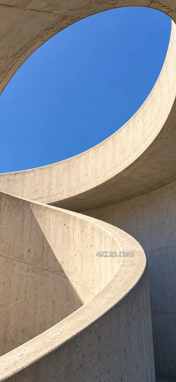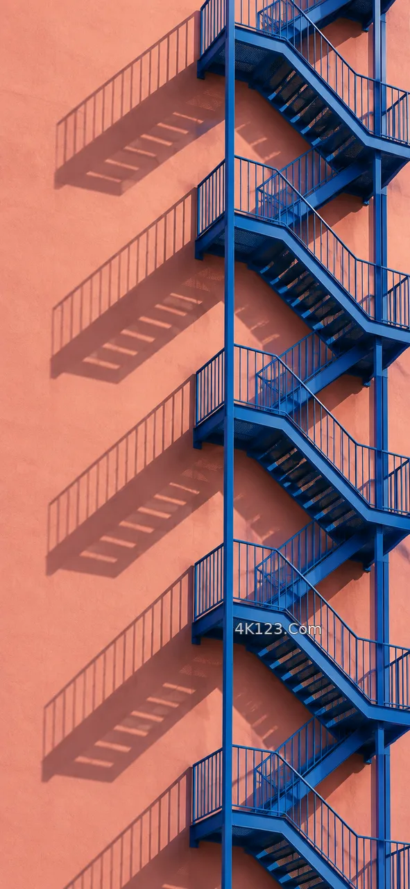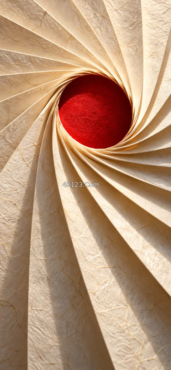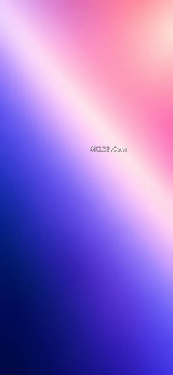
Both iOS and Android let the lock screen and the home screen carry different wallpapers, and the reason becomes clear after a day of use. The lock screen is seen for a second or two at a time, usually with nothing on it but a large clock and a few notifications. The home screen is looked at far longer, but always through a grid of twenty-odd icons, a dock and often a widget or two.
So the two jobs pull in opposite directions. A lock screen can take a strong subject, a face, a bright flower, a building full of detail, because the clock is the only thing it shares space with, and it is mostly the top third that needs to stay calm. A home screen does better with something quiet and evenly toned: a soft gradient, mist, open water, or the same photo blurred, which iOS offers as a one-tap option when you pair the two.
Pairing is where most of the fun is. Using a wide shot for the lock screen and a close crop of one corner of it for the home screen keeps the colours related while giving the icons an even backdrop. Each unlock then moves you a step further into the same scene, and the icons land on the part of it that has the least to say.