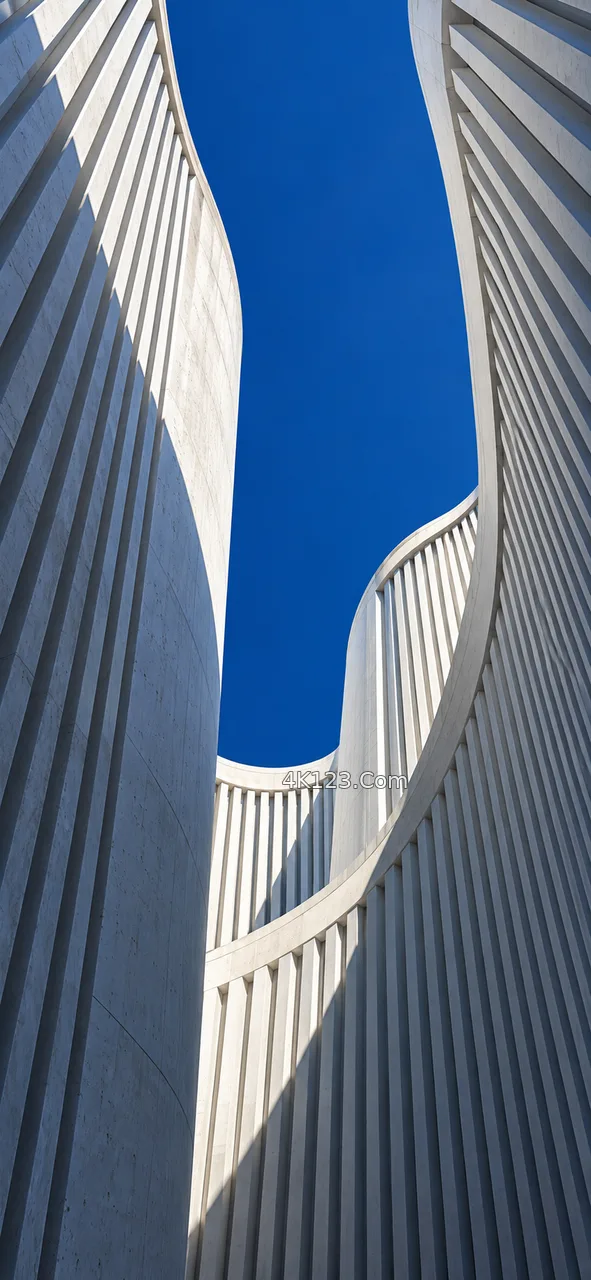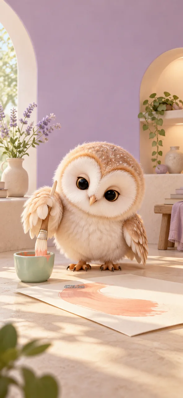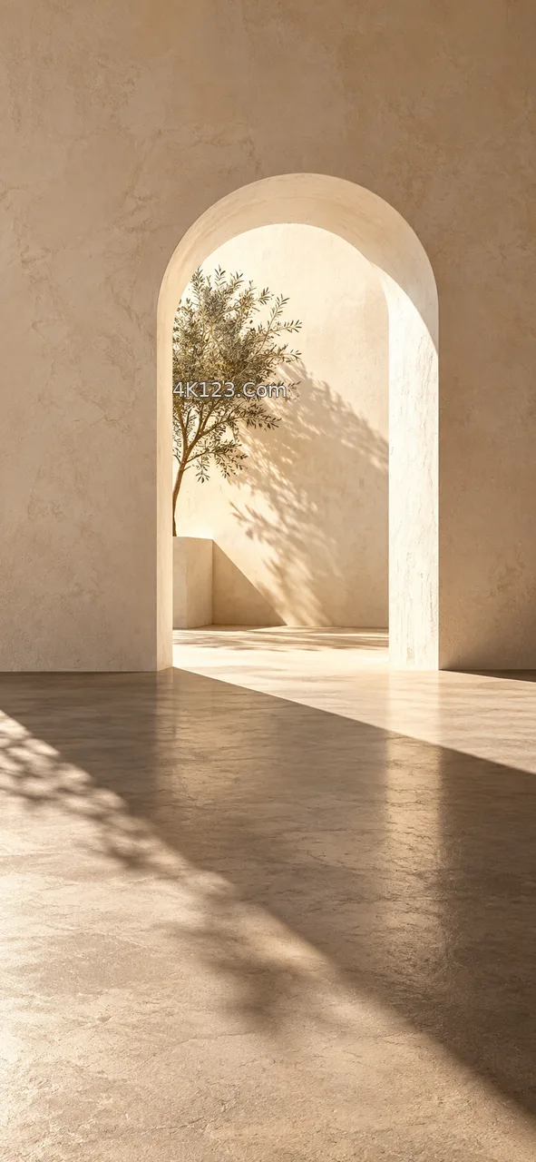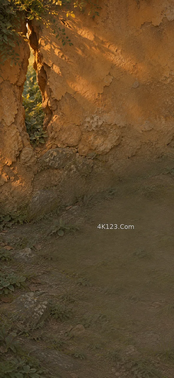
Most messaging apps let you replace the default backdrop of a conversation with your own image, either for every chat at once or for a single one. The setting sits a few menus deep, and the preview it offers is misleading: it shows the picture with two or three sample bubbles on it. A real conversation is denser. On a busy thread the bubbles cover well over half the screen, and what remains of the image is a narrow column down one side and thin bands between messages.
That geometry decides what survives. Incoming messages hug the left edge and outgoing ones the right, so the centre of the frame is the part most often covered, the reverse of a lock screen, where the centre is the safest place for a subject. Fine detail does badly too, because the eye is already reading text and treats a busy backdrop as noise; soft gradients, out-of-focus foliage, a plain stretch of sky or water hold up better. Brightness matters more than colour: bubbles are usually near white or a saturated tint, and a mid-dark background lets both kinds stand apart, which is why some apps add a dimming slider for dark mode.
Two more things are easy to miss. The background stays still while the messages scroll, so whatever sits in it will be passed over by hundreds of lines of text without moving, and when the keyboard opens the visible area shrinks to roughly the upper half, so anything interesting near the bottom goes out of use. A portrait image with its weight in the upper third, low contrast, and no single object asking for attention tends to last longest. It is a picture chosen to be talked over, and the good ones are the ones nobody mentions in the thread.