Where the Horizon Sits in the Frame
Move the line a little up or down and the same sea becomes a picture about sky or a picture about water.
A horizon is the one line in a landscape that a viewer checks without meaning to. Tilt it by a single degree and most people sense something is off before they can say what, which is why cameras ship with level indicators and why a sloping sea is among the most common fixes in editing. A level line reads as steady, and a good part of the calm in open-water photographs comes from that alone.
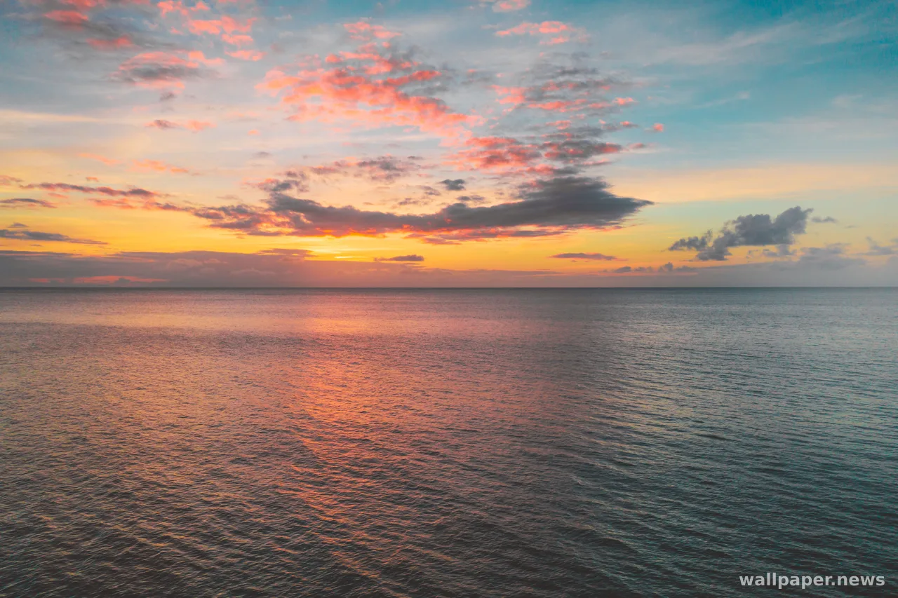
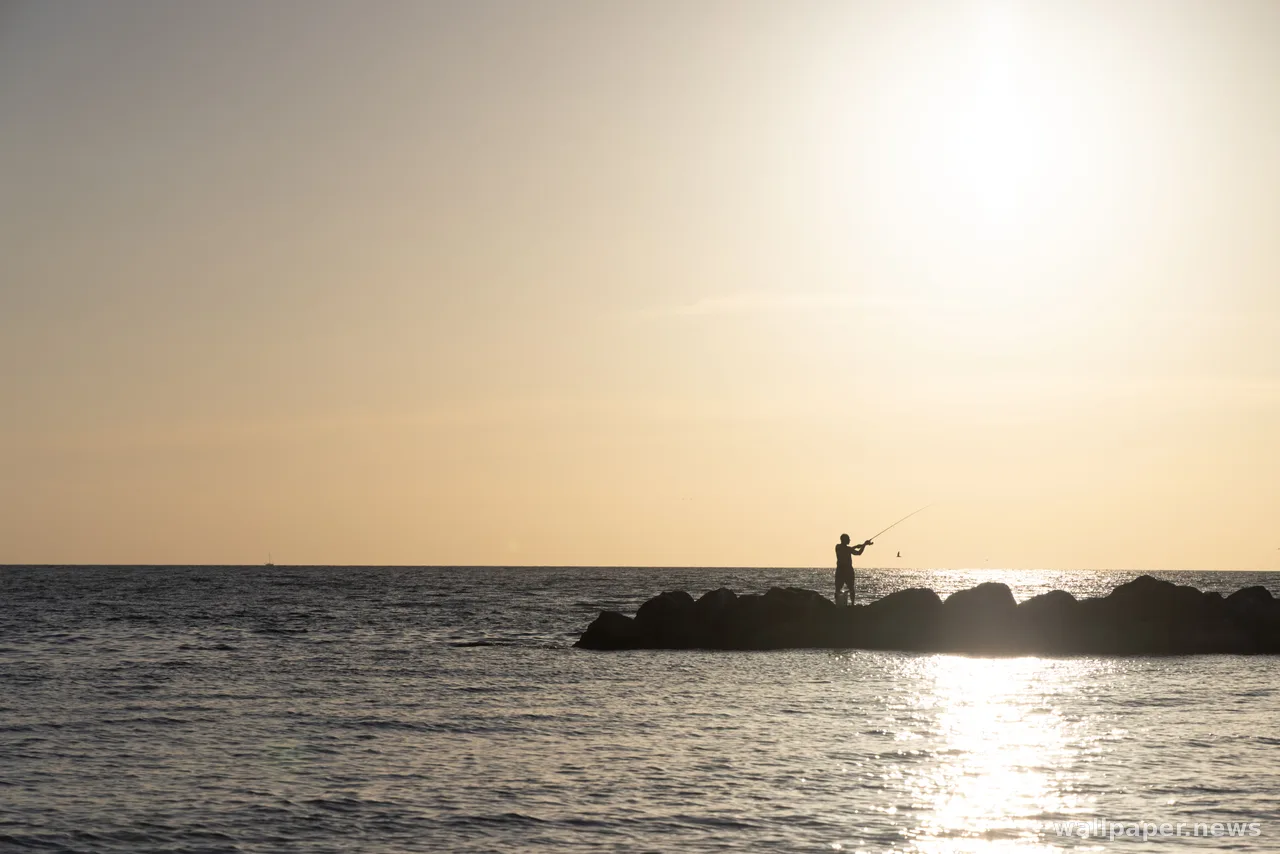
Height is the other decision. Put the horizon across the middle and the frame splits into two equal claims, sky against water, which suits a mirror-still lake and little else. Drop it to the lower third and the picture is about clouds; raise it to the upper third and the foreground takes over with ripples, rocks and wet sand. Some of the most restful seascapes go further and push the line almost to the edge, leaving a band of sea a finger wide under a tall field of graded sky.
On a screen the placement does practical work as well. A low horizon leaves a broad stretch of smooth sky where text and windows are easy to read, while a high one fills the lower part, where the dock or taskbar sits, with texture. Before setting a seascape as a background, it is worth checking where the line falls against your own icons, because a horizon running straight through a row of shortcuts is the spot the eye will keep going back to.


In this collection